
Purview DLP Incident Management (IM) – From Alert to Outcome #12
Purview DLP Incident Management (IM) – From Alert to Outcome #12
Phase 5 – Real Ops and Future State
Metrics That Matter.
Overview
If the first question your leadership asks about the DLP programme is “how many alerts did we get last month?“, the programme is being measured on the wrong thing.
Alert volume is an input metric. It tells you how busy the queue was. It says nothing about whether the programme is working, improving, or just accumulating technical debt in the form of un-closed incidents and tuned-out analysts.
This post covers what to measure instead, and why getting the measurement model right before running real-world scenarios matters more than most teams think.
Quick recap
In the previous post, we covered automation patterns for DLP response, from alert enrichment via Logic Apps through to approval-gated containment playbooks. VisionStack’s DLP Automation Ladder framed automation as a gradient of risk, where each step right requires more discipline, not less.
Phase 5 starts here. The series has covered how to build the operating model, how to configure the tooling, and how to automate the right things. This post establishes the measurement frame before the scenario walkthroughs that follow, so that when the demo runs, the outcomes are legible as more than just screenshots.

Why alert volume fails as a primary metric
Alert volume is seductive because it is immediately available, easy to trend, and gives the impression of measurement rigour. It is also largely meaningless as a standalone indicator.
High alert volume could mean that the programme is detecting real risk at scale. Or it could mean policies are too broad, generating noise that analysts have learned to ignore. Alert volume alone cannot distinguish between those two states.
The same problem applies to several adjacent metrics that DLP programmes typically report:
- Total incidents created: counts activity, not effectiveness
- Incidents closed: closure discipline varies wildly between teams; a closed incident is not the same as a resolved risk
- Policy match count by workload: useful for capacity planning, not for programme health
These are operational throughput metrics. They belong in a capacity dashboard. They should not be the primary lens for whether the DLP programme is doing its job.
The metrics that reflect programme health
The important distinction is between activity metrics (how much happened) and outcome metrics (what the programme achieved). A healthy DLP programme optimises for outcomes, and uses activity metrics only to explain them.
False Positive Rate
- What it measures: The proportion of closed incidents classified as False Positive out of total closed incidents in a given period.
- Why it matters: A high false positive rate indicates the policies are too sensitive relative to the business context they are operating in. It also erodes analyst trust. If most alerts are noise, the queue stops being taken seriously. A false positive rate above 30-40% in a mature programme warrants a policy tuning review.
- How to derive it: Defender XDR’s incident classification field supports True Positive, False Positive, and Informational, Expected Activity as closure categories. Querying closed incidents by classification gives you the raw data.
SecurityIncident
| where ProviderName == "Microsoft Data Loss Prevention"
| where Status == "Closed"
| where TimeGenerated > ago(30d)
| summarize Count = count() by ClassificationAlert-to-Incident Conversion Rate
- What it measures: The proportion of DLP alerts that result in a validated incident versus those dismissed at triage.
- Why it matters: A low conversion rate alongside a high alert volume is a signal that triage is functioning correctly. As in most alerts are noise and are being correctly dismissed. A high conversion rate alongside a low alert volume suggests either good policy precision or under-triaging. Neither can be interpreted without context.
- How to derive it: Compare alert count from the DLP Alerts dashboard in Purview or from AlertInfo in Defender Advanced Hunting against the count of incidents formally created and progressed beyond Tier 1.
Time-to-Triage
- What it measures: The time elapsed from alert creation to the first analyst action on the alert (status change, assignment, or comment).
- Why it matters: Extended time-to-triage indicates queue management problems, insufficient Tier 1 capacity, or escalation criteria that are too vague, causing analysts to delay decisions on ambiguous alerts. It is also a leading indicator of alert fatigue: as the backlog grows, triage time extends, which compounds the problem.
- How to derive it in Sentinel:
SecurityIncident
| where ProviderName == "Microsoft Data Loss Prevention"
| where TimeGenerated > ago(30d)
| extend TriageTime = datetime_diff('minute', FirstModifiedTime, CreatedTime)
| where TriageTime > 0
| summarize AvgTriageMinutes = avg(TriageTime), P90TriageMinutes = percentile(TriageTime, 90) by bin(TimeGenerated, 7d)
| order by TimeGenerated descEscalation Rate by Tier
- What it measures: The proportion of Tier 1 alerts escalated to Tier 2, and the proportion of Tier 2 incidents escalated to Tier 3.
- Why it matters: Escalation rate tells you whether tier boundaries are functioning. If Tier 1 escalates 90% of alerts, it is not functioning as a filter, it is functioning as a notification relay (or as I like to call it, a traffic light
 ). If Tier 2 escalates 5% to Tier 3, that is informative about the severity distribution of validated incidents. Both rates should be tracked separately and trended over time.
Incident Classification Distribution
- What it measures: The breakdown of closed incidents by classification across True Positive, False Positive, and Informational, Expected Activity (the Defender XDR label for what this series has been calling Benign Positive: a policy match that was technically correct but represented no actual risk).
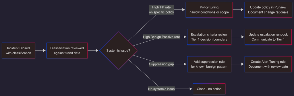
- Why it matters: The distribution tells you different things about different parts of the operating model. A high False Positive rate points at policy tuning. A high Informational, Expected Activity rate points at escalation criteria – too many low-risk events are making it all the way through to formal investigation. A healthy programme improves both over time as the feedback loop works correctly.
Suppression Rule Coverage
- What it measures: The proportion of alerts automatically resolved by Alert Tuning suppression rules versus those requiring human triage.
- Why it matters: Suppression rule coverage is a proxy for known false positive management maturity. A programme with no suppression rules is doing manual work on every recurrence of known benign patterns. A programme with a well-maintained suppression rule inventory handles those patterns automatically, preserving analyst capacity for alerts that warrant genuine attention.
SOC metrics versus compliance metrics
These are different audiences requiring different views of the same data. Conflating them is a common source of reporting friction.
SOC metrics: are operational. They inform decisions about capacity, process, and tooling. The metrics above – false positive rate, time-to-triage, escalation rate, classification distribution – are SOC metrics. The audience is the security operations team lead and the CISO.
Compliance metrics: are programme-level. They inform decisions about policy coverage, regulatory posture, and data risk. The audience is the DPO, compliance officer, or board-level risk function.
For compliance purposes, the relevant measures are different:
- Policy coverage by workload and data type: are all in-scope workloads and sensitive data types governed by active policies?
- Top violator patterns by department: are specific business units generating disproportionate incident volume?
- Label accuracy rate: what proportion of sensitive data is correctly classified at the time of a DLP event?
- Regulatory data exposure incidents: how many incidents involved data subject to specific regulatory obligations?
Purview Posture Reports covers several of these natively: top DLP policy violators, most triggered rules, highest-volume policies, and label adoption posture. As covered in Post 09, this capability grew directly out of the RAMP project work and is now a native in-product feature – no custom Power BI pipeline required for the baseline view.
The feedback loop from incident outcomes to policy
The metrics above are only useful if they trigger action. The action they should trigger is a structured feedback loop from incident outcomes back into policy and process.
The feedback loop requires two things to function:
- Consistent closure classification: if analysts are closing incidents without filling in the classification field, the data doesn’t exist to analyse.
- A named owner for the improvement cycle: typically a security engineer or DLP programme lead who reviews classification trends on a defined cadence (monthly is sufficient for most environments) and translates patterns into policy or process changes. Without a named owner, the data accumulates and nothing changes. This is one of the more common failure modes in otherwise well-designed DLP programmes.
A practical measurement cadence
Not every metric needs to be reviewed at the same frequency.
| Metric | Review cadence | Audience |
|---|---|---|
| Alert volume and queue depth | Weekly | SOC team lead |
| Time-to-triage (P90) | Weekly | SOC team lead |
| Escalation rate by tier | Monthly | SOC team lead |
| False positive rate | Monthly | SOC lead + DLP programme owner |
| Classification distribution | Monthly | SOC lead + DLP programme owner |
| Suppression rule review | Quarterly | DLP programme owner |
| Policy coverage and violator patterns | Quarterly | Compliance / DPO |
| Regulatory data exposure incidents | Per incident + quarterly summary | Legal / DPO |
The weekly metrics go into an operational dashboard. The monthly and quarterly metrics go into a programme review. Keeping them separate prevents the compliance audience from drowning in operational throughput numbers and the SOC from getting lost in regulatory framing.
What changes when the measurement model is right
When the metrics above are tracked consistently and the feedback loop is operational, three things improve over time:
- Policy precision increases as false positives are systematically identified and addressed.
- Analyst capacity improves as suppression rules handle known benign patterns and escalation criteria become better calibrated.
- The programme gains credibility. With the SOC (because the queue is manageable and outcomes are documented), and with compliance (because coverage and violation patterns are visible), and with leadership (because the programme can show risk reduction, not just alert counts).
None of that happens by tracking alert volume.
What’s coming next
The measurement frame is set. The next two posts put the operating model, the tooling, and the metrics all into practice. Running the two demo scenarios end-to-end, from first alert through to documented outcome, with the three RBAC personas from Post 04 working the way they were designed to.
Post 13 runs Scenario 1: an Exchange Online incident that travels the full path from Tier 1 triage to Tier 3 containment.
The views and opinions expressed in this post are solely the author’s own and do not reflect the views of their employer, clients, or any affiliated organisation. Nothing here is professional advice, and no content is based on confidential or client-specific information.
Leave A Comment
0 comments